The whole building,
on one screen,
for long-term care.
The Administrator Dashboard opens full-screen: your facility name in a branded header, a leadership quote of the day, and a five-tile stat strip — open tickets, compliance for the year, alerts sent, users added, accounts deactivated. Below it, nine cards lay out the rest in a masonry grid: meetings and events, work tickets, the alert log, injury and symptom reports from the last week, compliance by program, the federal and state filings you owe a regulator, purchase orders waiting on approval, who’s out today, and recent user changes. It refreshes itself every 30 minutes.
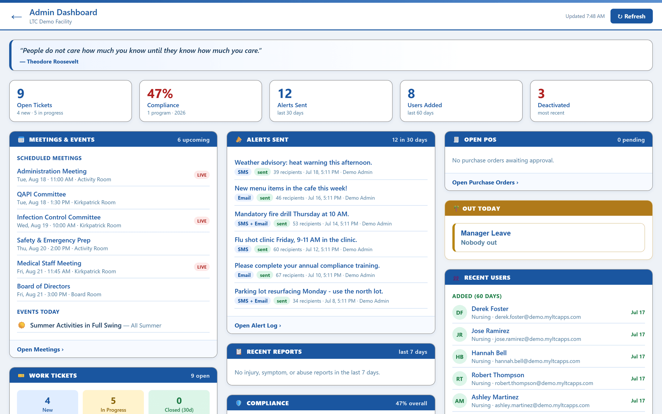
Everything worth knowing, already on screen.
No report to run, no module to open. The dashboard assembles what the rest of the suite already recorded and keeps it current on its own.
Five numbers, then nine cards, refreshed on their own.
The Administrator Dashboard is a full-screen masonry layout — branded header, your facility name, and every card on screen at once, which is why it works as well on a monitor in the office as it does on a laptop. A leadership quote of the day runs in a banner above the cards, and the whole screen auto-refreshes every 30 minutes, so the numbers are current without anyone reloading anything.
Across the top, five stat tiles: open tickets with a new-versus-in-progress breakdown, overall compliance for the current year (color-coded, so a slipping number looks like one), alerts sent over the last 30 days, users added over the last 60, and accounts deactivated in red. That strip is the fast answer to “is anything off today,” before you read a single card.
- ✓ Open tickets — total, plus new and in progress
- ✓ Compliance — overall for the year, color-coded
- ✓ Alerts sent — last 30 days
- ✓ Users added — last 60 days — and accounts deactivated
- ✓ Full-screen masonry cards with a branded facility header
- ✓ Auto-refresh every 30 minutes & quote of the day
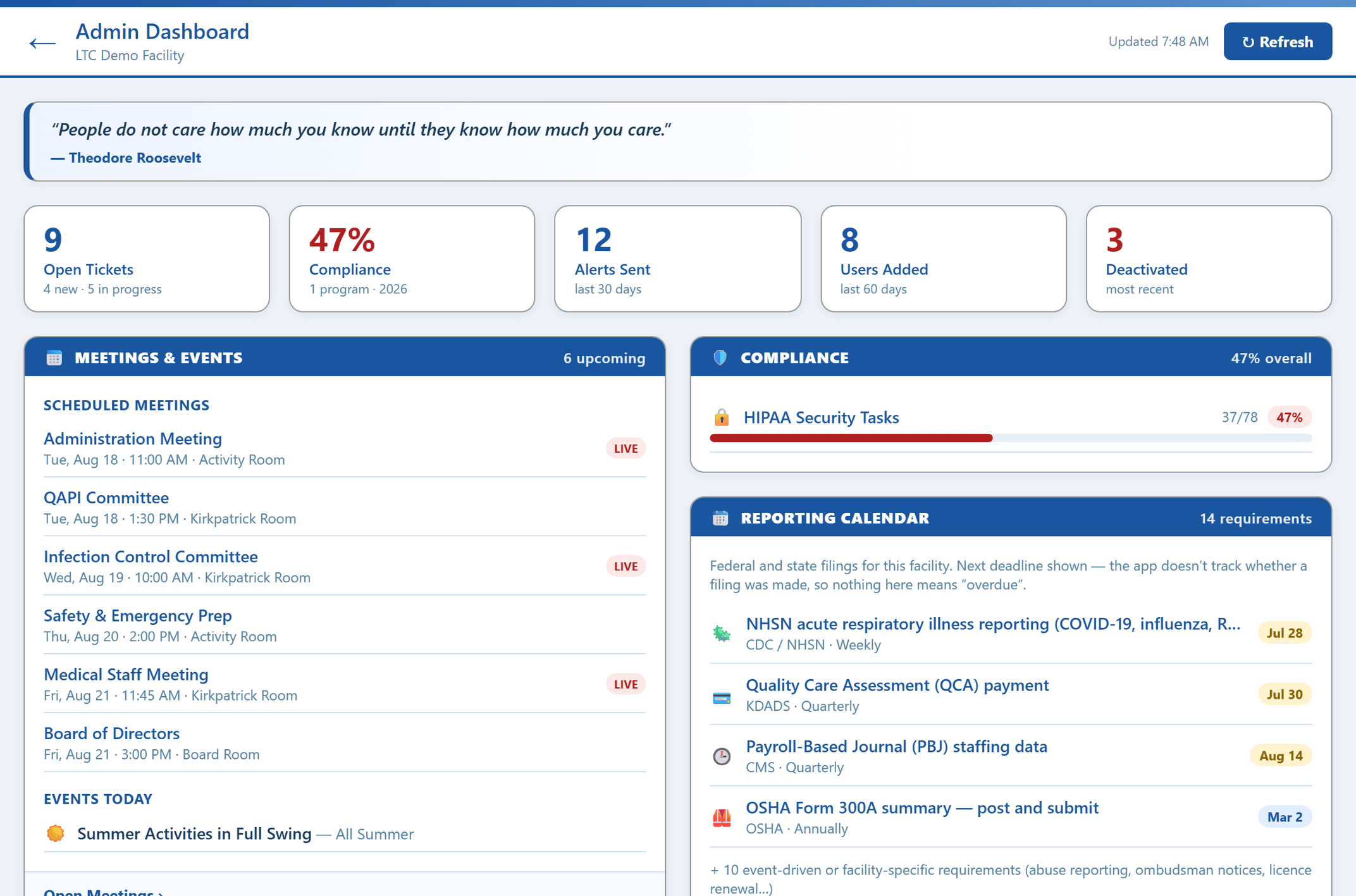
What’s open, what went out, what got filed.
The Work Tickets card counts new, in progress, and closed as three tiles, then lists every open ticket underneath — maintenance, IT, housekeeping — so nothing sits unresolved out of sight. Next to it, Alerts Sent shows the last six entries from the alert log with a chip for each one’s type and delivery status, which is how leadership confirms a message actually reached the building rather than assuming it did.
Recent Reports pulls injury, symptom, and abuse reports filed in the last seven days onto the same screen. The reports an administrator is responsible for knowing about arrive on their own, instead of waiting on a hand-off at the end of somebody’s shift.
- ✓ New, in progress & closed ticket counts
- ✓ Every open ticket listed, not just the count
- ✓ Last six alerts with type & status chips
- ✓ Injury, symptom & abuse reports from the last 7 days
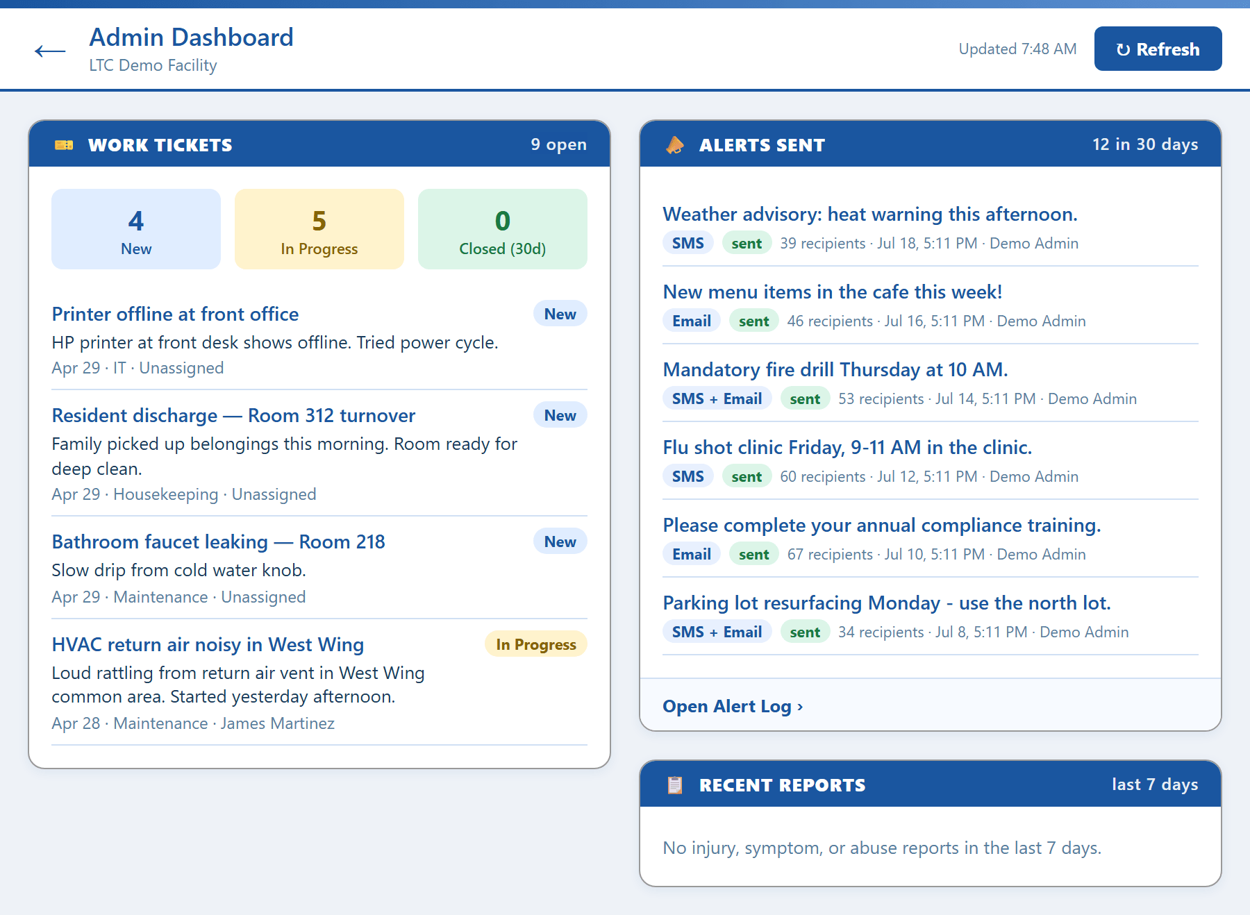
Where the percentage came from — and who’s not in the building.
The Compliance card breaks the overall number into its parts: completion for each compliance program with a progress bar per program, so you can see which training or requirement is dragging the total down rather than only knowing that it dropped. Beside it, the Reporting Calendar lists the federal and state filings this building owes a regulator with the next deadline first — NHSN respiratory reporting, the Quality Care Assessment payment, PBJ staffing data, the OSHA 300A summary — so a due date isn’t something you find out about late. Open POs lists purchase orders waiting on approval, so spending that needs a signature doesn’t stall for a week because nobody knew it was pending.
Out Today shows who’s on approved leave, so a short hall has an explanation before anyone asks for one. And Recent Users lists accounts recently added and recently deactivated, matching the two user tiles in the stat strip — access changes visible to leadership as they happen instead of at audit time.
- ✓ Per-program compliance completion with progress bars
- ✓ Federal & state filing deadlines, soonest first
- ✓ Purchase orders pending approval
- ✓ Who’s out on leave today
- ✓ Recently added & recently deactivated users
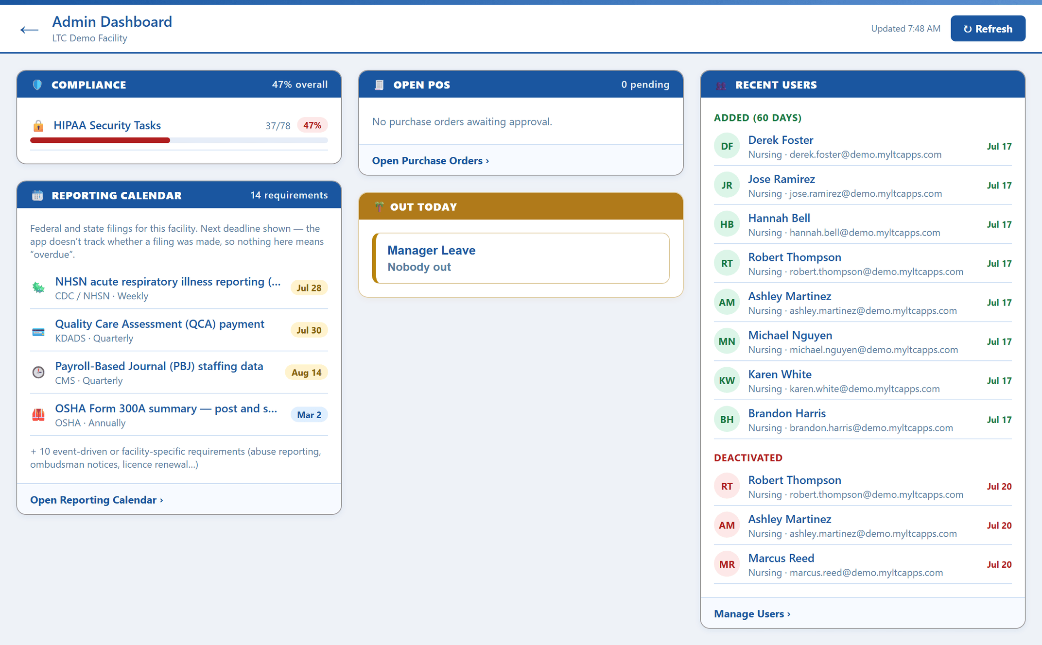
The full-screen read on your facility.
The stat strip and nine cards — meetings and events, work tickets, alerts sent, recent reports, compliance, the reporting calendar, open POs, out today, and recent users — laid out in a masonry grid that refreshes itself.
HIPAA-compliant, by design.
The Administrator Dashboard reads across the whole suite, so it’s built to the same HIPAA standard as everything it summarizes — encrypted, access-controlled, and hosted in U.S. data centers. It’s a leadership view: it aggregates what other modules already recorded, and the role a person was assigned governs what they can open from it. Injury, symptom, and abuse reports, ticket history, alert logs, and user changes all keep a permanent, paperless trail behind the summary on screen.
Administrator dashboard FAQ
What the stat strip shows, how tickets, alerts, reports, compliance, purchasing, and leave land on the screen, and how often it updates.
What is a nursing home administrator dashboard?
A nursing home administrator dashboard is one screen that shows the state of the building without anyone having to assemble it. In MyLTC Apps it opens full-screen in a masonry card layout with your facility name in a branded header, a leadership quote of the day, and a five-tile stat strip: open tickets, overall compliance for the year, alerts sent in the last 30 days, users added in the last 60, and accounts deactivated. Below the strip sit nine cards — meetings and events, work tickets, alerts sent, recent reports, compliance, the reporting calendar of federal and state filings, open purchase orders, who is out today, and recent user changes. It refreshes itself every 30 minutes.
What does the stat strip across the top show?
Five tiles. Open Tickets gives the total with a breakdown underneath — how many are new and how many are in progress. Compliance shows your overall completion percentage for the current year, color-coded so a slipping number looks like a problem instead of just reading as text. Alerts Sent counts what went out to staff in the last 30 days. Users Added counts new accounts over the last 60 days. Deactivated counts accounts that were switched off, shown in red. Together they are the fast answer to "is anything off today" before you read a single card.
How do work tickets and staff alerts appear on the dashboard?
Work Tickets is its own card: three tiles for new, in progress, and closed, with every open ticket listed underneath so nothing sits unresolved out of sight. Maintenance, IT, and housekeeping requests all land there. The Alerts Sent card shows the last six entries from the alert log, each with a chip for its type and its delivery status, so leadership can confirm a message actually reached the building. The stat strip mirrors both — open ticket counts and a 30-day alert total — for a read that doesn’t require scrolling.
What does the compliance card show, and what reports appear?
The Compliance card breaks the overall percentage into its parts: completion for each compliance program, with a progress bar per program, so you can see exactly which training or requirement is behind rather than only knowing the total dropped. Separately, the Recent Reports card pulls injury, symptom, and abuse reports filed in the last seven days onto the same screen. The reports an administrator is responsible for knowing about show up on their own, without waiting for a hand-off at the end of a shift.
Does the dashboard update on its own?
Yes. It auto-refreshes every 30 minutes, so a screen left open in the administrator’s office keeps showing current numbers without anyone reloading it. That is the point of the full-screen masonry layout — every card visible at once on a monitor, updating itself through the day. The header carries your facility name and branding, and a leadership quote of the day runs in a banner above the cards.
Is it HIPAA-compliant, and does it replace our clinical EHR?
It is HIPAA-ready by design — encrypted, access-controlled with role-based permissions, and hosted in U.S. data centers. The dashboard is a leadership read-only view: it aggregates what other modules in the suite already record, so what a given person can see is governed by the role they were assigned. It does not replace a clinical EHR like PointClickCare or MatrixCare. The Administrator Dashboard is the operational layer that runs alongside your clinical system — tickets, alerts, compliance, purchasing, leave, and reports — the day-to-day oversight a clinical LTPAC platform was never built to surface.
See the apps on your own phone.
Drop your details and we'll email you a link to the live demo. Click around on your own time — pricing is right here whenever you're ready to sign up.